Chipdip2

Heisman


Posts: 9,663
Joined: May 2007
Reputation: 64
I Root For: America
Location: Planet Earth |
Worst MAC logo
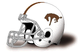
Big Slappie debate about which hideous logo they'll use when they replace the current carpet with a new remnant. They clearly hate their logo, but like a guy with an ugly girlfriend, they don't want to admit it. They prefer saying everyone's logo is hideous. Case in point.
Slappy Chimp 99 wrote
Posted: 1/14/2016 3:05 PM
Re: Turf
"i certainly agree regarding western's logo, but that doesn't make our logo any better. both are terrible. can we get a non-violent symbol from the tribe? if we are the chippewas, why is our logo a letter with lines behind it?"
I can't think of a single MAC team that doesn't have a unique marketable logo. All are well thought out and designed to sell licensed merchandise.
Only one, looks like it was thrown together on a whim, by a crack design team anxious to head out for their lunch break.................The Flying C.
How stupid are the people in their athletic department? Like Miami and EMU, when the casino robbers said you can't use their logo the morons in licensing at CMU should have moved on, found a logo they could dress in a mascot costume, something that was even marginally marketable, and got on with selling cool merchandise.
By far, the worst most unimaginative logo in the MAC.
My rankings
1. Huskies- Can't beat it when you can have a live animal on the sidelines
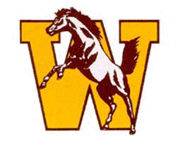
2. Bronco- Kids love Buster. He's approachable. The girl on the horse leading the team out of the tunnel is easily the most impressive run on in the MAC.
3. Cardinal- that Cardinal always puts on a good mascot fight.
4. Zips- they've done a great job marketing that Roo.
5. Bobcats- great design.
6. Rockets- looks like vibrator, but I've accepted it, and they've done a good job marketing it.
7. Golden Flashes- Unique
8. Falcons- for whatever reason, it just doesn't standout to me like the Balls bird.
9,10- RedHawks, Eagles.....made the best of a bad situation. Miami has owned the logo better that EMU has.
11- The flatialating alphabet letter.
(This post was last modified: 01-23-2016 10:02 AM by Chipdip2.)
|
|
| 01-23-2016 09:59 AM |
|
MajorHoople
Hall of Famer

Posts: 14,270
Joined: Apr 2007
Reputation: 176
I Root For: WMU Broncos
Location: Waldo, Read, Hyames |
RE: Worst MAC logo
Kent State's bird of ambiguous origin is puzzling on couple levels, can't be very inspirational. What does a bird have to do with "Flashes"?
They were better off when they had lightning bolts a la San Diego (soon to be LA) Chargers, but maybe they had to give them up - trademarks, copyrights, and all that.
|
|
| 01-23-2016 12:19 PM |
|
goldsworth
1st String


Posts: 1,479
Joined: Feb 2007
Reputation: 20
I Root For: WMU
Location: Dearborn |
RE: Worst MAC logo
No doubt about it the farting C is the worst logo of any team in the MAC. I'm a homer and think WMU has the best logo!
|
|
| 01-23-2016 02:31 PM |
|
Charm City Bronco
Fights for Justice
Posts: 5,211
Joined: Jun 2010
Reputation: 46
I Root For: WMU
Location: 20011 |
RE: Worst MAC logo
Best MAC logos---
1. WMU
2. BG
3. Toledo
Worst---
1. CMU
2. Kent
3. crAkron
|
|
| 01-23-2016 06:16 PM |
|
GullLake
Support Hong Kong protesters!


Posts: 2,518
Joined: Jul 2015
Reputation: 46
I Root For: Joe Manchin
Location: |
RE: Worst MAC logo
(01-23-2016 09:59 AM)Chipdip2 Wrote: Big Slappie debate about which hideous logo they'll use when they replace the current carpet with a new remnant. They clearly hate their logo, but like a guy with an ugly girlfriend, they don't want to admit it. They prefer saying everyone's logo is hideous. Case in point.
Slappy Chimp 99 wrote
Posted: 1/14/2016 3:05 PM
Re: Turf
"i certainly agree regarding western's logo, but that doesn't make our logo any better. both are terrible. can we get a non-violent symbol from the tribe? if we are the chippewas, why is our logo a letter with lines behind it?"
I can't think of a single MAC team that doesn't have a unique marketable logo. All are well thought out and designed to sell licensed merchandise.
Only one, looks like it was thrown together on a whim, by a crack design team anxious to head out for their lunch break.................The Flying C.
How stupid are the people in their athletic department? Like Miami and EMU, when the casino robbers said you can't use their logo the morons in licensing at CMU should have moved on, found a logo they could dress in a mascot costume, something that was even marginally marketable, and got on with selling cool merchandise.
By far, the worst most unimaginative logo in the MAC.
My rankings
1. Huskies- Can't beat it when you can have a live animal on the sidelines
2. Bronco- Kids love Buster. He's approachable. The girl on the horse leading the team out of the tunnel is easily the most impressive run on in the MAC.
3. Cardinal- that Cardinal always puts on a good mascot fight.
4. Zips- they've done a great job marketing that Roo.
5. Bobcats- great design.
6. Rockets- looks like vibrator, but I've accepted it, and they've done a good job marketing it.
7. Golden Flashes- Unique
8. Falcons- for whatever reason, it just doesn't standout to me like the Balls bird.
9,10- RedHawks, Eagles.....made the best of a bad situation. Miami has owned the logo better that EMU has.
11- The flatialating alphabet letter.
Our logo is fine, provided it also incorporates a "W." WMU also has to back away from black. Keep it on the rack.
CMU's is bad and became awful when it changed its colors to maroon and yellow.
|
|
| 01-23-2016 10:38 PM |
|


 /
Worst MAC logo
/
Worst MAC logo


