tyler90wm

Blue Raider


Posts: 2,235
Joined: Jan 2010
Reputation: 151
I Root For: MT
Location: |
Vintage SBC Helmets
(This post was last modified: 12-15-2010 08:08 PM by tyler90wm.)
|
|
| 12-15-2010 11:38 AM |
|
CJPanther
2nd String


Posts: 288
Joined: Jul 2010
Reputation: 5
I Root For: FIU
Location: |
RE: Vintage SBC Helmets
i only the the NCAA symbol... because of this i vote this thread as a FAIL 
|
|
| 12-15-2010 01:03 PM |
|
SpaceRaider
All American


Posts: 3,721
Joined: May 2002
Reputation: 157
I Root For: MiddleTennessee
Location: God's Country |
RE: Vintage SBC Helmets
(12-15-2010 01:03 PM)CJPanther Wrote: i only the the NCAA symbol... because of this i vote this thread as a FAIL
I hit the link and then refreshed and I was able to see the helmets.
|
|
| 12-15-2010 01:27 PM |
|
SOT1977
1st String
Posts: 1,411
Joined: Feb 2009
Reputation: 30
I Root For: ULM
Location: |
RE: Vintage SBC Helmets
The Helmet Project is a well-known link to many of us but, yeah, the rows upon rows of NCAA logos here is hard to look at. I can't get anything to come up on the thread at all.
|
|
| 12-15-2010 03:01 PM |
|
TroJam
Water Engineer


Posts: 4
Joined: Dec 2004
Reputation: 0
I Root For: TROY
Location: |
RE: Vintage SBC Helmets
I have always thought that the Louisiana helmet from 1997 with the 3 fleur-de-lis is a damn goodlooking helmet. It's an instant classic. I like it so much better then the current "Ragin Cajun" helmet which looks more like an Arena FB design, IMO.
|
|
| 12-15-2010 10:18 PM |
|
arkstfan

Sorry folks

Posts: 25,869
Joined: Feb 2004
Reputation: 994
I Root For: Fresh Starts
Location: |
RE: Vintage SBC Helmets
My opinion which isn't worth a lot. Is based on this basic criteria. Does it show up well in the stands and on TV, can a quick glance identify the team? I tend to not like mascot logos because absent a few classically designed logos they end up being too detailed and then look dated (Texas and Arkansas avoid that, and in turn have good mascot logos).
ArkSt, best helmet has been the stAte logo.
FAU, the currented winged letters logo is great. The owl is implied rather than drawn on.
FIU, sacraficed visibility adding the panther. The old letter only worked well, I'd like to see what could be done with a more timeless panther logo.
UL, the old USL was a good look, the tri-fleur was quite notable and a good claim stake to area history. Current has visibility issues.
ULM, school has a history of slap something together. For years it was Redskins replicas, the coloring of the logo doesn't pop and the logo is difficult to make out.
MT, the addition of lightining doesn't really stand out but the MT is so prominent that it works very well, even if you aren't sure what that is up there.
UNT. The 1983-93 shield and eagle was a nice look. A bit indistinct but a nice look. The 94 eagles was an abonimation that made the 95-00 eagle look better but just didn't have a THIS SPECIFIC SCHOOL feel to it. The switch to white helmets helps with the paragraph logo (maybe a color change would help UL). The flying worm is so retro it might work today.
Troy. I like the shield, it shows up better on the red helmet but can be hard to pick up at times, really only drawback.
WKU, like what they've done. Would like to see the towel a bit larger but otherwise works well.
|
|
| 12-16-2010 09:41 AM |
|
dahbeed
Heisman


Posts: 6,205
Joined: Jan 2005
Reputation: 507
I Root For: wku toppahs!!!
Location: in womans fantasies |
RE: Vintage SBC Helmets
i'm kinda diggin' the ulala one from late 60's to 73.
looks like the flag for a third world central american country....
![[Image: Louisiana-Lafayette_OLD2.gif]](http://www.nationalchamps.net/Helmet_Project/Louisiana-Lafayette_OLD2.gif)
which brings to mind immediately the demographics of cajun fans.....
very po' folks with bad teef...no shoes....and straw hats....
just like central americans....
see what i did right there???? i made myself LOL. i do that at times.
|
|
| 12-16-2010 11:23 AM |
|
SpaceRaider
All American
Posts: 3,721
Joined: May 2002
Reputation: 157
I Root For: MiddleTennessee
Location: God's Country |
RE: Vintage SBC Helmets
(12-16-2010 09:41 AM)arkstfan Wrote: ...MT, the addition of lightining doesn't really stand out but the MT is so prominent that it works very well, even if you aren't sure what that is up there...
I'd be happy with it if the 'lightning' mascot was dropped and otherwise left the same. The simpler the better I think. You can't really make out the mascot so leave it off.
|
|
| 12-16-2010 11:41 AM |
|
ULMSOT
Special Teams

Posts: 504
Joined: May 2009
Reputation: 12
I Root For: ULM
Location: |
RE: Vintage SBC Helmets
(12-16-2010 09:41 AM)arkstfan Wrote: My opinion which isn't worth a lot. Is based on this basic criteria. Does it show up well in the stands and on TV, can a quick glance identify the team? I tend to not like mascot logos because absent a few classically designed logos they end up being too detailed and then look dated (Texas and Arkansas avoid that, and in turn have good mascot logos).
ArkSt, best helmet has been the stAte logo.
FAU, the currented winged letters logo is great. The owl is implied rather than drawn on.
FIU, sacraficed visibility adding the panther. The old letter only worked well, I'd like to see what could be done with a more timeless panther logo.
UL, the old USL was a good look, the tri-fleur was quite notable and a good claim stake to area history. Current has visibility issues.
ULM, school has a history of slap something together. For years it was Redskins replicas, the coloring of the logo doesn't pop and the logo is difficult to make out.
MT, the addition of lightining doesn't really stand out but the MT is so prominent that it works very well, even if you aren't sure what that is up there.
UNT. The 1983-93 shield and eagle was a nice look. A bit indistinct but a nice look. The 94 eagles was an abonimation that made the 95-00 eagle look better but just didn't have a THIS SPECIFIC SCHOOL feel to it. The switch to white helmets helps with the paragraph logo (maybe a color change would help UL). The flying worm is so retro it might work today.
Troy. I like the shield, it shows up better on the red helmet but can be hard to pick up at times, really only drawback.
WKU, like what they've done. Would like to see the towel a bit larger but otherwise works well.
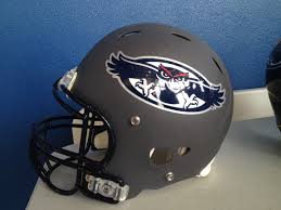
I know you said this was your opinion...but i think the newer color scheme is the best and the logo isnt hard to make out... I think they are the best yet. Some of the old ones were thrown together maybe...but not this one. I think we have something that we will stick with!
![[Image: 708781.jpg]](http://media.scout.com/media/image/70/708781.jpg)
|
|
| 12-16-2010 01:40 PM |
|
arkstfan
Sorry folks
Posts: 25,869
Joined: Feb 2004
Reputation: 994
I Root For: Fresh Starts
Location: |
RE: Vintage SBC Helmets
The new color scheme for ULM is better. But I think the photo makes my point. It looks like a curved blob that sort of resembles a bird.
|
|
| 12-16-2010 02:08 PM |
|
tyler90wm
Blue Raider
Posts: 2,235
Joined: Jan 2010
Reputation: 151
I Root For: MT
Location: |
RE: Vintage SBC Helmets
I liked ULM's helmet from 2003 and 2004-2005 (the gold and maroon helmet with an arrow on it).
|
|
| 12-16-2010 03:00 PM |
|
SkullyMaroo
Moderator


Posts: 11,218
Joined: Mar 2009
Reputation: 639
I Root For: South Alabama
Location: Mobile |
RE: Vintage SBC Helmets
(12-16-2010 03:00 PM)tyler90wm Wrote: I liked ULM's helmet from 2003 and 2004-2005 (the gold and maroon helmet with an arrow on it).
Me too.
|
|
| 12-16-2010 03:03 PM |
|
WestEndRaider
Bench Warmer

Posts: 217
Joined: Sep 2010
Reputation: 11
I Root For: MTSU
Location: Nashville, TN |
RE: Vintage SBC Helmets
I started going to MTSU games in '99 so I remember seeing some of these. It's nice seeing them again.
|
|
| 12-16-2010 04:22 PM |
|
WestEndRaider
Bench Warmer
Posts: 217
Joined: Sep 2010
Reputation: 11
I Root For: MTSU
Location: Nashville, TN |
RE: Vintage SBC Helmets
(12-16-2010 11:41 AM)SpaceRaider Wrote: (12-16-2010 09:41 AM)arkstfan Wrote: ...MT, the addition of lightining doesn't really stand out but the MT is so prominent that it works very well, even if you aren't sure what that is up there...
I'd be happy with it if the 'lightning' mascot was dropped and otherwise left the same. The simpler the better I think. You can't really make out the mascot so leave it off.
Yeah, I think just the MT would look nice. It's not bad the way it is but like you said, sometimes simpler is better.
|
|
| 12-16-2010 04:24 PM |
|
T2003
1st String

Posts: 1,028
Joined: Jan 2009
Reputation: 29
I Root For: Troy & Auburn
Location: |
RE: Vintage SBC Helmets
(12-15-2010 10:18 PM)TroJam Wrote: I have always thought that the Louisiana helmet from 1997 with the 3 fleur-de-lis is a damn goodlooking helmet. It's an instant classic. I like it so much better then the current "Ragin Cajun" helmet which looks more like an Arena FB design, IMO.
totally agree!!
|
|
| 12-16-2010 04:32 PM |
|
stebo
2nd String
Posts: 355
Joined: Nov 2007
Reputation: 26
I Root For: North Texas
Location: |
RE: Vintage SBC Helmets
(12-16-2010 09:41 AM)arkstfan Wrote: My opinion which isn't worth a lot. Is based on this basic criteria. Does it show up well in the stands and on TV, can a quick glance identify the team? I tend to not like mascot logos because absent a few classically designed logos they end up being too detailed and then look dated (Texas and Arkansas avoid that, and in turn have good mascot logos).
ArkSt, best helmet has been the stAte logo.
FAU, the currented winged letters logo is great. The owl is implied rather than drawn on.
FIU, sacraficed visibility adding the panther. The old letter only worked well, I'd like to see what could be done with a more timeless panther logo.
UL, the old USL was a good look, the tri-fleur was quite notable and a good claim stake to area history. Current has visibility issues.
ULM, school has a history of slap something together. For years it was Redskins replicas, the coloring of the logo doesn't pop and the logo is difficult to make out.
MT, the addition of lightining doesn't really stand out but the MT is so prominent that it works very well, even if you aren't sure what that is up there.
UNT. The 1983-93 shield and eagle was a nice look. A bit indistinct but a nice look. The 94 eagles was an abonimation that made the 95-00 eagle look better but just didn't have a THIS SPECIFIC SCHOOL feel to it. The switch to white helmets helps with the paragraph logo (maybe a color change would help UL). The flying worm is so retro it might work today.
Troy. I like the shield, it shows up better on the red helmet but can be hard to pick up at times, really only drawback.
WKU, like what they've done. Would like to see the towel a bit larger but otherwise works well.
That 1994 Eagle was Clip Art - I shite you not. Oh how we do not miss Craig Helwig.
|
|
| 12-17-2010 12:06 AM |
|
arkstfan
Sorry folks
Posts: 25,869
Joined: Feb 2004
Reputation: 994
I Root For: Fresh Starts
Location: |
RE: Vintage SBC Helmets
So the 1995-> eagle was colored in clip art?
|
|
| 12-17-2010 08:39 AM |
|
OwlFamily
FLORIDA ATLANTICS DEFENDER OF THE FAITH

Posts: 7,113
Joined: Dec 2007
Reputation: 251
I Root For: FLORIDA ATLANTIC
Location: Boca Raton, FL. |
RE: Vintage SBC Helmets
(12-16-2010 04:32 PM)T2003 Wrote: (12-15-2010 10:18 PM)TroJam Wrote: I have always thought that the Louisiana helmet from 1997 with the 3 fleur-de-lis is a damn goodlooking helmet. It's an instant classic. I like it so much better then the current "Ragin Cajun" helmet which looks more like an Arena FB design, IMO.
totally agree!!
:iagree:
After looking at it it really stands out. Its a symbol easily identified with Louisianna and there really isnt another helmet like it, except for of course the Saints.
I think they should go back to that.
|
|
| 12-17-2010 09:13 AM |
|


